# Quick CSS Quiz
> Test your CSS knowledge with these tricky questions covering margin collapsing, percentage units, line-height inheritance, CSS specificity, and z-index layers.
CSS might be a total mystery to you or a topic that’s near and dear to your heart. Whether you think of CSS as a "necessary evil" or think of it as the power to control the world of technology, CSS is a must-have for anyone working on web applications. A deep knowledge of CSS can be the difference between a beautiful, polished web application and one that just feels like "meh".
In this series, I try to focus on CSS weird parts, throw quiz and its answer, hoping to give a better understanding of how CSS works in depth.
Before checking this answers please give yourself a couple of minutes to think about it, to make sure you benefit from this quiz.
## Problem #1
Having the following code snippet, for two adjacent siblings divs, `#div1` has a margin of 50px, `#div2` has a margin of 20px.
what is the distance between those two div?
```html
A
B
```
### Options:
- 20px
- 30px
- 50px
- 70px
### The answer:
First of all, because the div is a block-level element it will take the full width of the container, so the distance between the two divs is the vertical distance.
Due to "margin collapsing", the top and bottom margins are collapsed into a single margin whose size is the largest of the individual margins, which is 50px.
---
## Problem #2:
Having the following code snippet, for two divs, the `#container` div has a width of **300px** and hight of **200px**, the `#box` div has **100%** padding-left and padding-top.
what is the rendered `#box` div width and height respectively?
```html
```
### Options:
- 200px and 200px
- 300px and 300px
- 200px and 300px
- 300px and 200px
### The answer:
To know why this is the right answer we have to dig into how the CSS percentage unit works, the percentage unit is a CSS relative unit so it has to be relative to an absolute value, and this is summary of how it works with different properties:
margin, padding, left, right
It will be relative to element's parent width (even top and bottom margin/padding will be relative to the parent’s width)
top, bottom
It will be relative to element's parent height
transform
It will be relative to the element itself, either its width or its height.
So here we are working with padding top and left properties, and both are relative to the #container's width and be calculated based on its value.
---
## Problem #3:
Having the following code snippet, for a paragraph element with **font-size** equals *12px*, you want the paragraph's `line-height` to be equals to the double of its `font-size`(*24px*). Which of the following `line-height` values will achieve this if you apply it to the `body` element?
(note that the default font-size for browser is *16px*)
```html
Having fun solving CSS Quiz
```
### Options:
- 200%
- 2em
- 2
- double
### The answer:
To solve this quiz correctly, we should understand the line-height behavior with different values.
:
The browser compute the line-height value for the current element, then nested child elements will inherit this fixed value form it.
For the first two options (which produce same results, gotcha!)
body line-height = 16 * 2 = 32px
p line-height = 32px inherited from body element
(unitless):
Tells the browser to every nested element line-height value is this number multiplied by the element's own font size. In most cases, this is the preferred way to set line-height and avoid unexpected results due to inheritance.
For 2 option
body line-height = 16 * 2 = 32px
p line-height = 12 * 2 = 24px (which is the correct answer)
For more info:
line-height MDN
3 things (almost) no one knows css
---
## Problem #4
```html
```
```css
#header.is-red {
color: red;
}
span.is-blue {
color: blue;
}
.is-green {
color: green;
}
```
The previous code snippets, for three different HTML elements wrapped in a div `.wrapper`, each element has a different color as specified in the style snippet, if you added the following CSS code at the end of the stylesheet what will be the color for header, span, and paragraph elements?
```css
.wrapper :not(#happy) {
color: black;
}
```
### Options:
- header is red, span is blue, and paragraph is green
- header is red, span is blue, and paragraph is black
- header is red, span is black, and paragraph is black
- all elements are black
### The answer:
You can find this challenge very easy this time, if you know how "[CSS Specificity](http://www.standardista.com/css3/css-specificity/)" works, but I want to mention here that you can use `:not` pseudo-class with a fake id to increase selector specificity, rather than using `important` keyword.
Let's calculate each selector's specificity:
a- `#header.is-red` (1-1-0)
b- `span.is-blue` (0-1-1)
c- `.is-green` (0-0-1)
And the rule-set selector's specificity is (1-1-0), which is greater than a and b selectors and equal to c, but it comes last in the stylesheet; so its declaration will apply over the all three selectors, and all elements will have a black color.
---
## Problem #5
```html
```
```css
.red, .green, .blue, .black {
position: absolute;
width: 200px;
height: 200px;
}
.red {
background: red;
top: 0;
left: 0;
}
.green {
background: green;
top: 50px;
left: 50px;
}
.blue {
background: blue;
top: 100px;
left: 100px;
}
.black {
background: black;
top: 150px;
left: 150px;
}
```
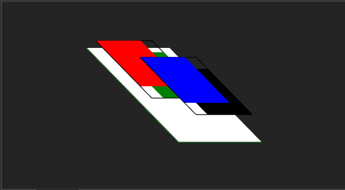
The previous code snippets, for four squares positioned on top of each other, every square slightly moves to the left from the previous square's position so you can easily spot which one is on top of which.

squares positioned on top of each other
If I use the following snippet to re-arrange the squares rendering order, what will be the final order of the squares form back to front?
```css
.red { z-index: 100; }
.blue { z-index: 50; }
.green { z-index: 2; }
.black { z-index: 0; }
.first { transform: translateZ(10px); }
```
### Options:
- red, green, blue, black
- black, blue, green, red
- green, red, black, blue
- black, green, blue, red
## The answer:
This quiz requires a deep knowledge of how CSS z-index works, we will start by applying the first four CSS rule-sets:
```css
.red { z-index: 100; }
.blue { z-index: 50; }
.green { z-index: 2; }
.black { z-index: 0; }
```
This will re-arrange the squares as flowing: `.black` in the most back then `.green` then `.blue` and finally the '.red' at the top, this arrange is intuitive, an element with a larger z-index covers an element with a lower one.
But when you add the final rule-set
```css
.first { transform: translateZ(10px); }
```
You expect to move the `.first` two square (red and green squares) to be on top of the other squares (black and blue squares), but you got a completely different output, and the z-index now is completely unreasonable.
CSS has layers which is slightly looks like the Photoshop layers (surprise), z-index arrange elements within that layer, larger z-index element on top and the smaller on bottom, that's what happened when you added `transform` property you make `.first` a separate layer with auto z-index, so it will behind the `.second` div elements.
And this is how it will looks in [Chrome DevTool Layers Panel](https://www.youtube.com/watch?time_continue=60&v=6je49J67TQks)