# The CSS I Knew Has Evolved: Advanced Features, New Identity
> Exploring modern CSS features that have transformed web development - from container queries and CSS Grid to the new CSS logo and advanced layout capabilities that make centering elements trivial.
The world of frontend development has changed drastically since I began my journey as a front-end developer a decade ago. CSS itself has not only evolved in capabilities but also embraced a fresh, modern identity with a new logo that symbolizes this evolution.
Lucky for me, I didn't start in the dark days of table-based layouts, but I did witness the rise of Flexbox and the bittersweet death of `float` and `clear` CSS properties. If you’re unfamiliar with these terms, you might want to take a nostalgic look at [Bootstrap 3’s grid system](https://getbootstrap.com/docs/3.3/css/#grid).
The death of Internet Explorer marked a turning point. The web technologies started evolving at lightning speed, making it both exciting and challenging to keep up.
Here’s a look at some modern CSS features I wish had existed when I started my journey as in web development. These advancements would’ve saved me countless hours of frustration and made CSS development a lot more fun.
---
## Centering a Dev
There are plenty of memes mocking CSS for lacking an easy way to center a div element. Luckily, those dark days are gone we now have the single CSS property `place-content`
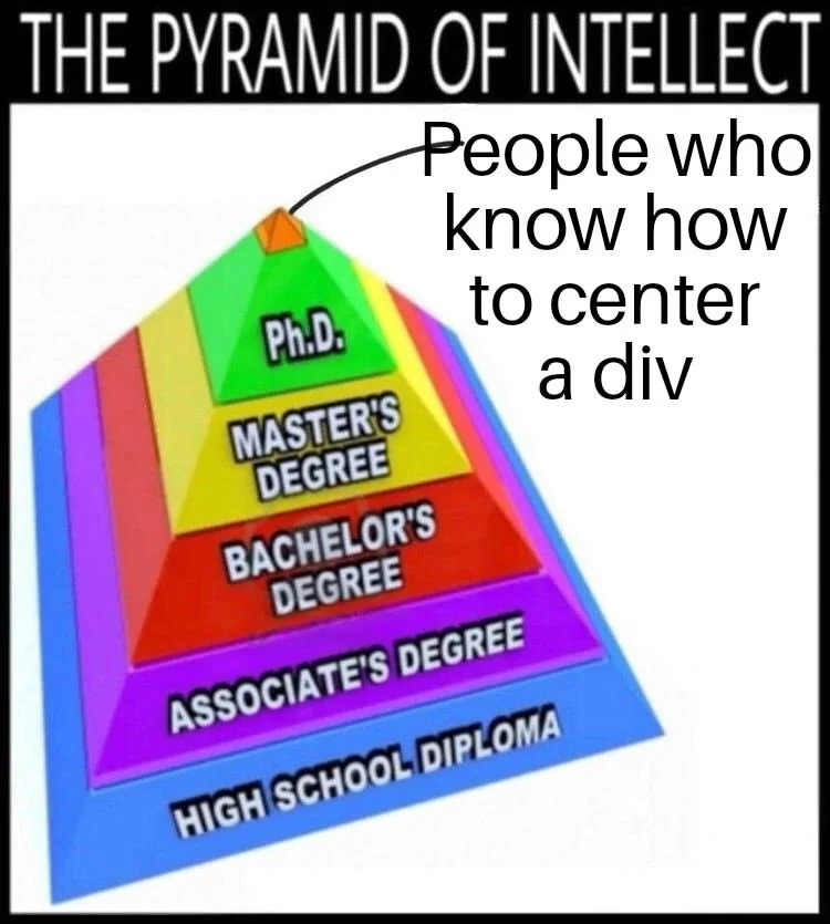
An online meme about centering a div
### Centering Vertically and Horizontally
Using Grid, you can center elements effortlessly:
```css
.is-centered {
display: grid;
place-content: center;
}
```
Alternatively, Flexbox offers another simple solution:
```css
.is-centered-flex {
display: flex;
justify-content: center;
align-items: center;
}
```
### Vertically Centering a Block-Level Element
With the introduction of [the align-content property for block layouts](https://web.dev/blog/align-content-block), you can now center a div vertically using `align-content`, which works properly without requiring a flexbox wrapper.
```css
.is-vertically-centered {
display: block;
align-content: center;
}
```
## Nested Selectors
Preprocessors also introduced nested selectors, which make styles more structured and readable. Without them, we were stuck duplicating selectors like this:
```css
.button {
color: red;
}
.button:hover {
color: white;
}
```
Today, native CSS lets you write:
```css
.button {
color: red;
&:hover {
color: white;
}
}
```
It’s cleaner, it’s readable, and it’s finally supported in all modern browsers.
## `:is()` and `:where()`
Selectors just got a lot smarter with these pseudo-classes. They let you simplify complex styles that previously required lots of duplication:
```css
article:is(.featured, .highlighted):is(:hover, :focus) > h2:is(.title, .subtitle) {
color: blue;
}
```
Without
(), the same CSS would’ve looked like this monstrosity:
```css
article.featured:hover > h2.title,
article.featured:focus > h2.subtitle,
article.highlighted:hover > h2.title,
article.highlighted:focus > h2.subtitle {
color: blue;
}
```
**9k tip:** The difference between [`:is()`](https://developer.mozilla.org/en-US/docs/Web/CSS/:is) and [`:where()`](https://developer.mozilla.org/en-US/docs/Web/CSS/:where) lies in specificity. While `:is()` inherits the specificity of its most specific argument, `:where()` always has zero specificity. perfect for low-priority defaults.
## Container Queries
Responsive design has always revolved around viewport widths, but container queries take a more intuitive approach: responsiveness based on an element’s parent container.
```css
@container (min-width: 700px) {
.card h2 {
font-size: 2em;
}
}
```
This is a game-changer for modular and reusable components. Let’s start adopting it more widely, folks!
## The clamp() Function
Once upon a time, I worked on a typography-heavy [project](https://www.baianat.com/) that required fonts to scale fluidly with the viewport. My first instinct? Use something like `font-size: 0.5vw;` that would do the trick, right?
WRONG! It was a nightmare. We had to carefully control how the font resized relative to the viewport, which involved complex mathematical equations. Plus, we needed to ensure the text wouldn't become too large or too small.
Then I discovered a treasure—an [article](https://blog.typekit.com/2016/08/17/flexible-typography-with-css-locks/) that addressed exactly this use case. It resulted in a monster of a Stylus-CSS mixin that handles all the corner cases (remember, it was the preprocessor era 🙃)
When I learned that the clamp() function is now supported natively, I was both excited and surprised, given its specific use case.
Now you can achieve similar results much more elegantly by combining the `clamp`, `min`, and `max` functions
```css
.selector {
width: clamp(min(10vw, 20rem), 300px, max(90vw, 55rem));
}
```
## Honorable Mention: Modern Color Features
CSS color management has evolved dramatically, offering a plethora of new systems and tools. Features like color-mix() and support for LCH and LAB color spaces deserve their own article. stay tuned for that!
## Resources
- [Using CSS Variables](https://developer.mozilla.org/en-US/docs/Web/CSS/Using_CSS_custom_properties)
- [Nesting Selectors](https://developer.mozilla.org/en-US/docs/Web/CSS/Nesting_selector)
- [The
() and
() Pseudo-Classes](https://developer.mozilla.org/en-US/docs/Web/CSS/:is)
- [Container Queries](https://developer.mozilla.org/en-US/docs/Web/CSS/CSS_containment/Container_queries)
- [Fluid Typography with clamp()](https://www.smashingmagazine.com/2022/01/modern-fluid-typography-css-clamp/)
- [Transition to height: auto & display: none Using Pure CSS](https://blog.css-weekly.com/transition-to-height-auto-display-none-using-pure-css?utm_source=CSS-Weekly&utm_campaign=Issue-589&utm_medium=web)