Many developers prefer to use the font-icons over the SVG ones because it has a simpler syntax, and it integrates seamlessly with almost any front-end component library.
In this article, I will try to demonstrate the technics I follow to make it easily to SVG icons.
TL;DR
You can find the final component here: AppIcon.vue.
Using
First, let's look at an SVG heart-icon syntax:
<svg viewBox="0 0 24 24">
    <path d="M12,21.35L10.55,20.03C5.4,15.36 2,12.27 2,8.5C2,5.41 4.42,3 7.5,3C9.24,3 10.91,3.81 12,5.08C13.09,3.81 14.76,3 16.5,3C19.58,3 22,5.41 22,8.5C22,12.27 18.6,15.36 13.45,20.03L12,21.35Z" />
</svg>
You see here that most icons are alike, except for the path's d attribute, which describes the icon shape. So, we can wrap this into a useable Vue component, which accepts the icon's path as a prop.
// AppIcon.vue
<template>
  <svg class="icon" style="width:24px;height:24px" viewBox="0 0 24 24">
    <path :d="path" />
  </svg>
</template>
<script>
export default {
  name: 'AppIcon',
  props: {
    path: String,
  },
};
</script>
Although we have wrapped our icon into a usable component, we can enhance this more. We can store all the app icons paths in a js object, to make it easier to access the icon using its name rather than the long initiative path. To get your icon's path, you can use your custom-designed icons, or get them from this awesome website: https://materialdesignicons.com/.
I also use Svgus app to manage my icons sets.
// icons.json
{
  "heart": "M12,21.35L10.55,20.03C5.4,15.36 2,12.27 2,8.5C2,5.41 4.42,3 7.5,3C9.24,3 10.91,3.81 12,5.08C13.09,3.81 14.76,3 16.5,3C19.58,3 22,5.41 22,8.5C22,12.27 18.6,15.36 13.45,20.03L12,21.35Z"
}
// AppIcon.vue
<template>
<svg
class="icon"
style="width:24px;height:24px"
viewBox="0 0 24 24"
>
<path :d="path" />
</svg>
</template>
<script>
import icons from './icons.json';
export default {
name: 'AppIcon',
props: {
name: String,
},
computed: {
path() {
return icons[this.name];
},
},
};
</script>You can also use the npm package @mdi/js, to easily import icons' path, instead of copying and pasting it.
// icons.js
import { mdiHeart } from '@mdi/js';
export default {
  heart: mdiHeart
};
Now we can use our icon-component easily across the app
<app-icon name="heart" />Styling
To use our icons we should able to resize it and change its color easily.
SVGs use width/height properties to control its size, and fill/stroke properties to control its colors. Unlike font-icons which use font-size and color to control the icon visuals.
Let's suppose you are using bootstrap as your main components library. If you added an SVG icon inside a button before the text, you will find it's very challenging to set the icon size and colors, without explicitly setting the icon's fill in normal status and hover status and size to much the button size.
We will map the properties of the icon to be controlled using font-size and color. Now when the element font-size changes the icon will follow its size. And by following when the button's color changes the icons will too.
🧙♂️ Let's use this magical snippet to achieve this:
.icon {
  width: 1em;
  height: 1em;
  fill: currentColor;
}
As you can see now, the icon's size will depend on the element's font-size. And luckily for us, the currentColor value is here to save our day, and also it's supported in all browsers (even IE 9 😲).
Let's refactor our component, to make our icon flexible enough, and also accepts color status and different sizing.
I useed 1.2em instead of 1em as the default value. This will give a better visual harmony
// AppIcon.vue
<template>
  <svg
    viewBox="0 0 24 24"
    class="icon"
    :class="styleClasses"
  >
    <path :d="path" />
  </svg>
</template>
<script>
import icons from "./icons.json";
export default {
  name: 'AppIcon',
  props: {
    name: String,
    size: String,
    color: String,
  },
  computed: {
    path() {
      return icons[this.name];
    },
    styleClasses() {
      return [this.size, this.color].map(val => val && `is-${val}`);
    },
  },
};
</script>
<style>
/* default */
.icon {
  width: 1.2em;
  height: 1.2em;
  fill: currentColor;
}
/* sizes */
.icon.is-large {
  width: 2em;
  height: 2em;
}
.icon.is-medium {
  width: 1.6em;
  height: 1.6em;
}
.icon.is-normal {
  width: 1.2em;
  height: 1.2em;
}
.icon.is-small {
  width: 1em;
  height: 1em;
}
.icon.is-tiny {
  width: 0.8em;
  height: 0.8em;
}
/* colors */
.icon.is-primary,
.icon.is-blue {
  fill: #2196F3
}
.icon.is-success,
.icon.is-green {
  fill: #4CAF50
}
.icon.is-danger,
.icon.is-red  {
  fill: #F44336
}
.icon.is-warning,
.icon.is-orange {
  fill: #FF9800
}
</style>
Performance
The AppIcon component we created earlier is relatively simple. It doesn’t manage any state, watch any state passed to it, and it has no lifecycle methods. It can be perfectly refactored into a functional-component. Since functional components are usually much faster than normal components, this will boost our app performance, especially if we are using many icons.
template-based functional components, introduced in Vue 2.5.0+.
<template functional>
  <svg
    viewBox="0 0 24 24"
    class="icon"
    :class="$options.methods.getStyleClasses(props)"
  >
    <path :d="$options.methods.getPath(props)" />
  </svg>
</template>
<script>
import icons from "./icons";
export default {
  name: "AppIcon",
  props: {
    name: String,
    size: String,
    color: String,
  },
  methods: {
    getPath(props) {
      return icons[props.name];
    },
    getStyleClasses(props) {
      return [props.size, props.color].map(val => val && `is-${val}`);
    },
  },
};
</script>
The downside of using functional components is it requires you to explicitly add attributes and events-listener to the root element, to make it behave as a normal component.
<template functional>
  <svg
    viewBox="0 0 24 24"
    class="icon"
    :class="$options.methods.getStyleClasses($options)"
    v-bind="data.attrs"
    v-on="listeners"
  >
    <path :d="$options.methods.getPath($options)" />
  </svg>
</template>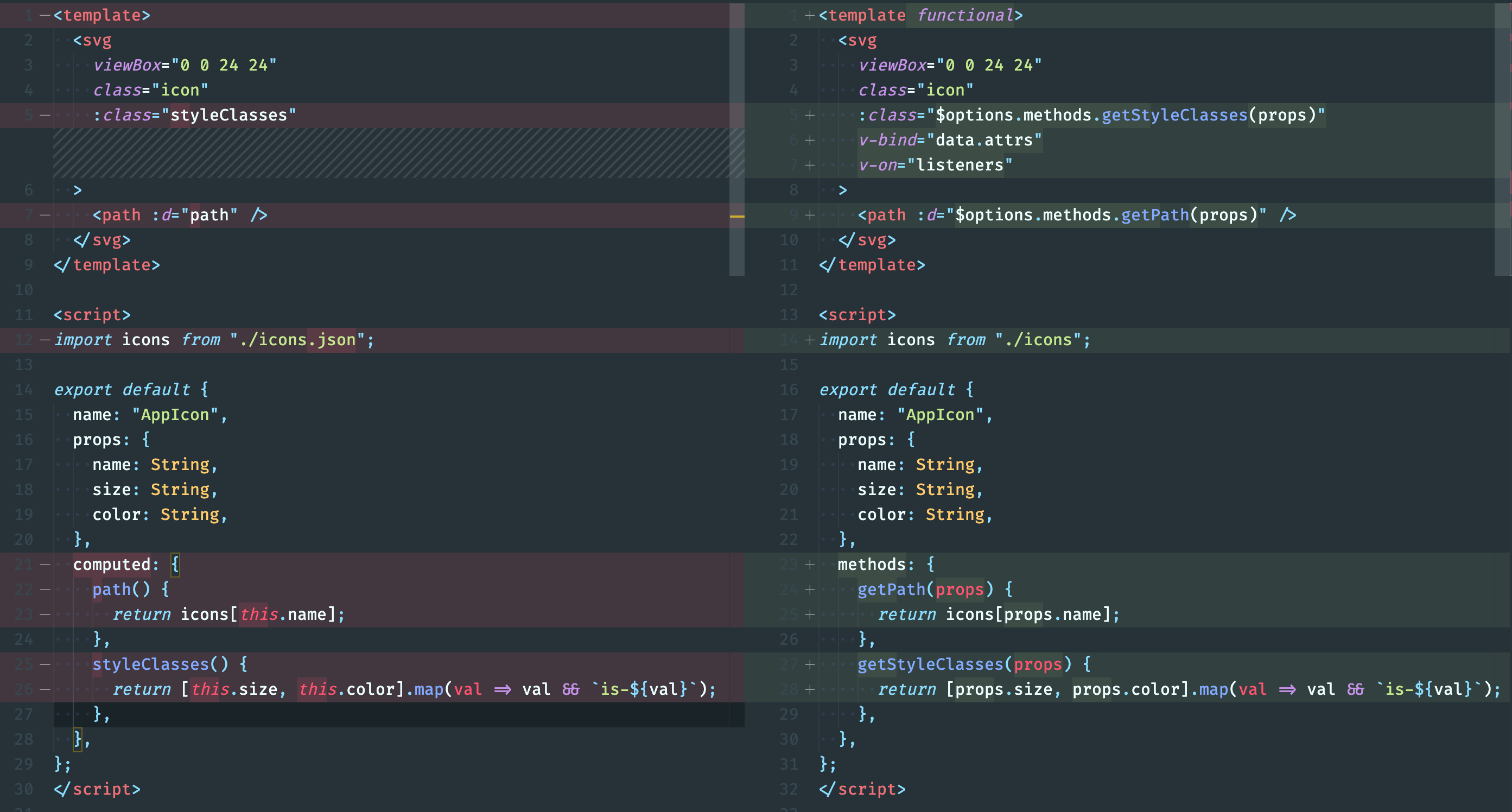
Accessibility
The last piece in our puzzle is to make our icons accessible, for screen-readers and every user for our app.
To achieve this, we will add a title element inside our icon with the icon name, and add aria-role, you can also add a description for a long icon description.
<template functional>
  <svg
    viewBox="0 0 24 24"
    class="icon"
    :class="$options.methods.getStyleClasses(props)"
    v-bind="data.attrs"
    v-on="listeners"
  >
    <title>{{ props.title || props.name }}</title>
    <desc v-if="props.desc">{{ props.desc }}</desc>
    <path :d="$options.methods.getPath(props)" />
  </svg>
</template>
<script>
import icons from './icons.json';
export default {
  name: "AppIcon",
  props: {
    name: String,
    size: String,
    color: String,
    title: String,
    desc: String,
  },
  methods: {
    getPath(props) {
      return icons[props.name];
    },
    getStyleClasses(props) {
      return [props.size, props.color].map(val => val && `is-${val}`);
    },
  },
};
</script>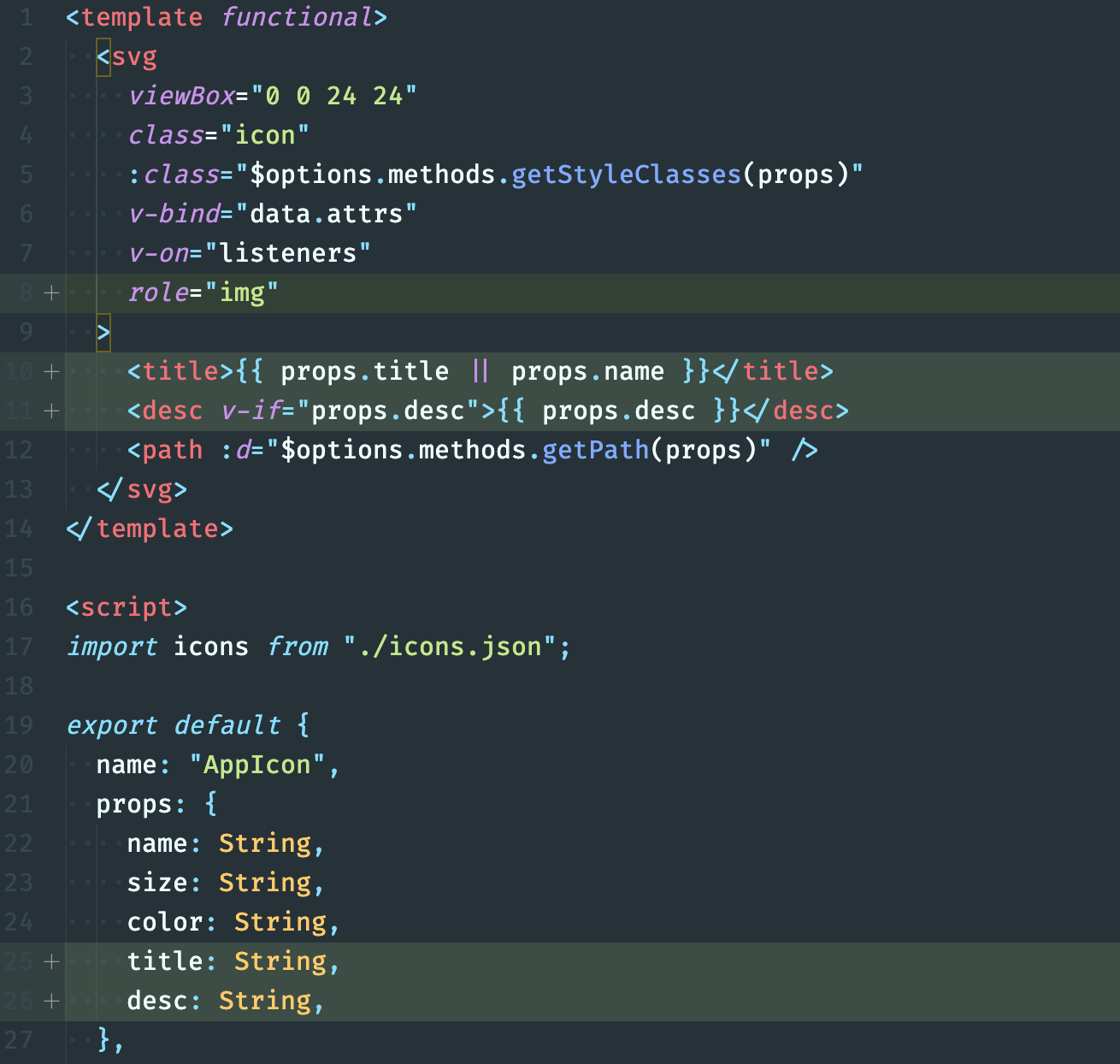
Consolation
We have reviewed how we can easily integrate SVG icons with our Vue apps. You can find the final component in this repo.
{% github Abdelrahman3d/use-svg no-readme %}
Thanks for reading 😄😄